by Mary Shipp
Of all the elements that go into a multicolored
needlework composition, I believe that none is more important
than the successful use of color and value. We will cover the
high points about color theory here; for a much more complete
discussion of color, please see my book, Color for Embroidery, or any other book about color theory written after 1980.
This is Part One of a two part article.
In this section we will learn some of the words used to define
color and look at color harmony through a discussion of the seven
traditional color chords. In Part Two, which will appear later,
we will consider color contrast and emphasis, both of which are
necessary in a good design.
I can remember, as a very young child,
being told by my mother that I could not wear my pink blouse
with my orange and white plaid cotton skirt, because "those
two colors do not go together." Most of you were probably
told something similar at some point in your lives. This concept
that certain colors clash is no longer considered valid
by color theorists, but it still persists in the popular imagination,
and is, I believe, the cause of much of the color insecurity
that needleworkers suffer from. I hope to be able to set those
insecurities at rest.
About the
Author
Mary Shipp is the author of several
needlework books, as well as a designer and teacher. Her most
recent book is Design for Embroidery; she is also the author
of Color for Embroidery and several books on various embroidery
techniques. These volumes have established her reputation for
clear diagrams and good verbal descriptions. Mary's objective
as a teacher is to develop materials that will encourage students
to experiment with color, thread and stitches, and discover that
they, too, can create needlework designs. Out of her teaching
materials have come a number of smaller booklets, one of which,
Stitching with Overdyed Thread, features various variegated threads
from The Caron Collection. We urge you to support the designers
who are contributing the outstanding free classes and features
you see at this site. Click here for
information on ordering Mary's books and booklets.
Color Terminology
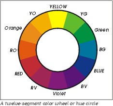 When
artists speak of color they often refer to a color wheel or hue
circle, which are two different terms for the same thing. The
color wheel shown here is a common one that is useful for our
purposes. It has twelve divisions, but that does not mean that
there are only twelve colors. Imagine that the color wheel has
been cut, right through the yellow area at the top, and straightened
out into a bar. This is shown below, and indicates that color
is a continuum. Here the colors blend from one to the next; there
are an infinite number of colors in the world.
On the twelve hue circle, the three primary
colors are shown in capital letters, as RED, YELLOW, and BLUE.
The secondary colors are shown in capitals and lower case letters;
they are Green, Violet, and Orange. Six intermediate colors
are also shown (as abbreviations); they are YG, for yellow green,
etc. Notice that the intermediate colors all have two-word names
taken from the colors on either side of their color block. (Yellow
green is between the primary color yellow and the secondary color
green on the color wheel. It is a mixture of these two colors.)

What are shown on the color wheel are the hues. This word is used two ways by color writers and
artists. First, it is the "family name" of the color
being discussed. A stitcher might say, "I want to stitch
this area in a pale tint of yellow." Here, yellow refers to the hue, and the phrase "a pale tint of..."
further describes the appearance of the yellow. Hue can also
refer to a color at what is called maximum saturation, in other
words, not adulterated by another color, white, black, or gray.
 Some
of the other words used to describe color are defined below.
Intensity/Saturation refers to how much of a color there is in a given
mixture. At the immediate right you see three intensities of
the hue blue. Rectangle (a) is a blue of low intensity
or saturation, a pale blue. Rectangle (b) is a darker blue than
that in rectangle (a), but lighter than the blue in rectangle
(c). Rectangle (b) is of middle intensity. Rectangle (c)
is pure blue (the hue). It is a high intensity
blue. We could also say it is fully saturated.
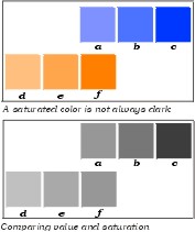 Value concerns lightness/darkness in comparison to a
scale of grays that runs from white to black. White has the highest
possible value; black has the lowest, and various grays are referred
to as high middle, middle, and low middle. In the next illustration,
three values of orange and three values of blue are shown. Square
(f) of the orange is fully saturated, the strongest pure orange
you can have. In other words, it is the hue orange. It
is also the darkest orange possible without the addition black
or some other darker color. It is the same value as square
(a) of the blue above it, which is relatively light as far as
blues are concerned. How do we know it is the same value? Look
at the lower portion of this illustration, where I have translated
all the colored blocks to their respective gray values. In this
part of the illustration, you cannot tell the difference between
"orange" block (f) and "blue" block (a).
They are the same value of gray, and "rank the same on the
value scale."
We see that values differ from color to
color. When we speak of a low value orange(Example f) the color
we are thinking of will be mcuh lighter than a low value blue
(Example c).
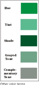 The
next illustration shows various ways to adulterate the hue green
to achieve different effects. When we adulterate, we change the
value of the color, making it either higher (lighter) or lower
(darker). In the illustration, we have the hue green, along with
a tint, a shade, and two types of tones of green.
Tints are those colors which are produced by adding
white to a color. They are always higher in value than the hue.
Shades are those colors which are produced by adding
black to a hue. They are always darker than the hue.
Tones are either:
(1) Those colors which are produced by adding gray to a hue.
I call these grayed tones. They may be lighter than the hue if
the gray added is lighter than the hue, they may be darker if
the gray is darker than the hue, or they may be the same value
if the gray used is the same value as the hue.
(2) Those colors which are produced by adding the color's
complement to the color itself. (We will discuss complementary
colors very shortly.) I call these tones complementary tones.
The two tones shown at the right have the same gray-scale
value, but they are quite different in appearance. We will discuss
Value Scales in the next part of this article.
Note: the words shade and tone are often misused. People often
speak of "a shade of pink." It's not worth fighting
about, but the terms as defined above are those in common usage
in the more advanced and accurate books about color. (Some authors
do not use the word "tone". I find it very convenient
to be able to differentiate between shades and tones, and to
further break down types of tones as I have above.)
We are much more apt to use tints, shades, and tones in embroidery
than we are to use hues.
The Value Scale
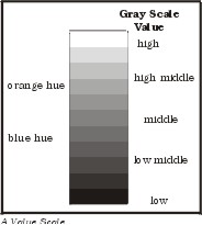
Value is defined above as the relationship between light and
dark when compared to a scale of grays that runs from white to
black. For the purposes of discussion, white and black will be
referred to as colors. Such a "gray scale" is shown
here; it has eleven steps. A gray or value scale may have as
many steps as necessary to distinguish between the value level
of various colors. Some people recommend fourteen levels, some
recommend nine, some recommend other levels. Note that white
has the highest value and black the lowest.
In an earlier example we compared the values of two different
hues, orange and blue, at different saturations. Rectangle (f)
of the lower row of boxes was fully saturated orange, as dark
an orange as is possible without adulteration with either black
or another dark color. Note that to have the same value the blue
must be decidedly unsaturated. Fully saturated blue is quite
a bit darker than fully saturated orange. Note the position of
the hues orange and blue in the illustration at the right.
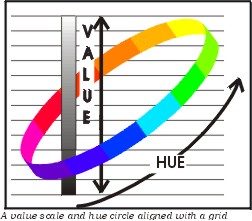 The
next illustration is a diagram of the value scale (vertical pole)
aligned with a grid. The value scale (the long skinny vertical
object in the middle) is a continuum, with barely recognizable
steps or breaks. This was done to emphasize that value is a continuum,
not a set of discrete levels of lightness and darkness. In addition,
the diagram contains a color wheel, which is shown at an oblique
angle, so that it is aligned with the same grid. The grid makes
it easier to pick a particular color and follow the grid lines
back to the value scale. We see from this that yellow is the
hue with the highest value and blue-violet the hue with the lowest
value.
Color Harmony
When people speak of colors that do or do not "go together"
they are speaking about color harmony. The old fashioned way
to discuss color harmony is in terms of chords. The term itself
is a carry over from the days (150 years or so ago) when color
theorists tried to relate color to music. Between 1800 and about
1930, various "rules for color" were created that were
supposed to guarantee an attractive color scheme. As we will
see, the rules became outdated, and modern color theorists have
more or less abandoned them. This is not to say that the color
chords themselves should be abandoned. They are still useful,
in a way that I will shortly explain.
First, I urge you to go outside on a sunny autumn day and
look at a maple leaf or even at a spruce or pine tree against
the blue sky; both are color combinations that were considered
improper by some early color theorists. The leaf combines red,
orange and yellow, and the tree against the sky gives us green
and blue. Mother Nature is not as inhibited about color as we
are! The fact of the matter is that every color "goes with"
every other color, as long as you have a pleasing combination
of hues, tints, tones, and shades.
How do we learn what is a "pleasing combination of hues,
tints, tones, and shades"? There is nothing to learn. If
you like it, use it. If you don't like it, don't use it. It's
just that simple.
This set of seven traditional color chords will help get you
started in combining colors. They are time-tested color pairings,
and can be worked out from any color wheel. When I find myself
using the same color combination in too many of my designs I
often turn to these color chords for inspiration.
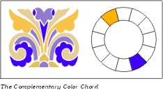 In
these examples, each of these traditional color chords will contain
the hue blue violet. We refer to this as the key color.
The complementary color chord. This is the traditional
set of "go withs" as far as color combinations. We
all know that "red goes with green" and "yellow
goes with violet." If you look at a color wheel you will
see that in each of these pairs of colors one is directly across
from the other. Another complementary color chord that you might
not think of automatically can be discovered from looking at
the color wheel. What color is directly across the wheel from
blue violet? It's yellow orange. Shown at the right is a design
using this particular color chord. It includes the hue blue violet,
as well as a tint of the same color, plus two shades of yellow-orange.
Other complementary color chords we might not think of at
first are yellow green paired with red violet, and blue green
with red orange. Notice that these three chords use the intermediate
colors. We automatically think of complementary chords containing
one primary and one secondary color, but often we ignore those
made from the intermediate colors.
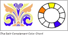 The
split complement chord. This color chord contain three colors.
We see the hue and a tint of blue violet, just as we did above.
However, instead of using yellow orange (the direct complement
of blue violet) for the remainder of the design, we picked the
colors on either side of yellow orange, namely yellow and orange.
In other words, we moved from the "key color" blue
violet, to its complement, then shifted one step to each side.
Split complement chords can be very interesting because they
introduce a subtle difference from what we expect. In the design
I used light a tone of yellow and a darker tone of orange. Both
tones were created by adding gray to the original hue.
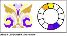 The
double complement chord. This chord uses four colors, arranged
in two pairs of complementary colors. Once again, our key color
is blue violet, shown as an extremely light tone with just a
hint of gray. The hue of violet is also used. Violet's complement
is yellow, shown here as a tint. The fourth color is a tone of
yellow-orange, this time a complementary tone created by adding
blue-violet instead of gray. Notice how this moves the yellow
orange toward brown, when compared to the pure hue shown on the
color circle. You should return to the definition of tint, shade
and tone if you do not remember the difference between grayed
and complementary tones. By adding white, black, gray and a complement
to certain of the colors we have designed a color scheme that
contains colors many people would tell you "don't go together."
You may not like them, but they do "go together."
Now let's move to a pair of more simple color schemes. They
are no less attractive or valid than the ones discussed above.
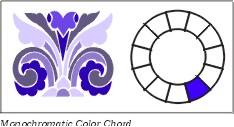 The
monochromatic color chord. In a monochromatic color chord,
tints, shades, and tones of only one hue are used with the hue.
In the illustration all the colors used are various values of
blue violet. Included are the hue, a tint, a shade, and a very
grayed tone.
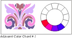
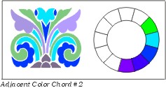
The adjacent color chord. Up to five colors which are
next to each other on the color wheel may be used in an adjacent
color chord. The first example uses tints, tones, and shades
of red, red violet, violet, and blue violet. The second example
uses violet, blue violet, blue, blue green, and green. Note how
different these two adjacent color chords look, yet they both
contain blue violet. Adjacent chord #1 is often referred to as
a warm color scheme; adjacent cords #2 as a cool one.
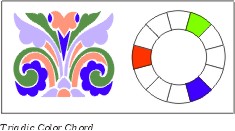
The triadic color chord. This chord has three colors,
equally spaced around the color circle. To find the colors, you
may count. First, pick your key color, in this case, blue violet.
Name your key color "one", and count clockwise up to
five. Then count counter clockwise from the key color, also to
five. These three colors will be equally spaced around the hue
circle. In the illustration, the triadic chord is made up of
blue violet, red orange, and yellow green, in an assortment of
hues, tints, and shades.
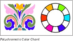
The polychromatic color chord. Poly- means many. This
chord contains six different hues, equally spaced around the
color wheel. It is sometimes called the double triad or the hexad.
The example is made up of tints, tones, and shades of the six
intermediate hues, yellow green, blue green, blue violet, red
violet, red orange, and yellow orange. Be aware that this is
really too many colors for this particular design. In a larger
design, six colors might do very well, but this is a chord that
needs careful handling any time.
Here is a little exercise that will sum up what we have
learned thus far.
Print out the DIAGRAM below
or the whole article (the diagram is on a separate page to make
printing it easier). Have the empty color circle shown at the
right available, as well as a pencil or pen. Now read back through
the descriptions of the seven color chords, beginning with the
Complementary Chord. I mentioned at the beginning of that discussion
that "each of these traditional color chords will contain
the hue blue violet" so put a check in the segment of the
color circle that represents blue violet.
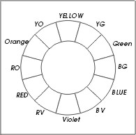
As you read through the descriptions of the seven traditional
color harmonies, each time you come to a new color name,
place a check in the appropriate segment of the hue circle to
indicate that that particular color "goes with" blue-violet.
When you have finished you will have proved my point. When all
of the traditional color chords are taken into consideration,
every possible color combination is included. Does this work
only with blue violet? No! No matter which color you use as your
key color (the one upon which the chord is based) you will find
that every other color on the color wheel is paired up with that
key color in one or another of the traditional color chords.
What does this mean? Surely there are some colors that "don't
go with" other colors. Not really, in terms of modern-day
color theory. However, culture, habit, and personal preference
also play a part in our thinking about color. These factors have
led us to believe that some color combinations are better than
others. Nature is not so judgmental. In a rainbow, all the colors
go together.
Click here for PART
II
Ordering Mary
Shipp's Books
Mary Shipp teaches at EGA and ANG Guilds,
needlework shops, the Rockome Illinois Cross Stitch Festival,
and other needlework events. Her main occupation is as an author
of self-published books on needlework, and of design booklets.
Her books, listed below, are available in needlework shops. Shop
owners may contact her at Stitches by Shipp, 7426 Fish Hatchery
Road, Bath, NY, 14810. (607) 776-2759, wholesale inquiries
only, please. Retail customers whose local shops do not carry
Mary's books may call The Golden Unicorn, Corning, NY (607) 776-2759;
Stitchery Row, Endicott, NY, (607)748-8003; Ellen Nell, Inc.,
Winston Salem, NC (800)499-1224; Ruth Kern Books, Phoenix, AZ
(606) 943-0738, or Hard-to-Find Needlework Books, Newton Center,
MA (617) 969-0942. All of these firms ship mail order and do
charge orders.
Books by Mary D. Shipp:
Stitches for Counted Thread Embroidery, 1995. A two-volume stitch encyclopedia, describing
over 250 stitches in clear, easy to read format. 626 pages total.
Sold only as a two-volume set, $64.75 per set, plus postage.
Color for Embroidery, 1997. This book contains two sections, Part 1,
a discussion of color theory in general terms with color illustrations.
Part 2, color theory as applied directly to embroidery, with
detailed examples. 130 pages, $49.75, plus postage.
Exploring Pattern in Stitches, l997. Presents a discussion of techniques used
to develop diaper and other all-over patterns in any counted
technique. Includes over fifty sample patterns with variations,
plus a short discussion of color. 87 pages. $26.50, plus postage.
A New Look at Blackwork, 1998. Chapters on several Blackwork techniques,
as well as the history of Blackwork. Over 25 different stitches
used in Blackwork are clearly and comprehensively diagrammed.
Directions for 5 different projects are included, plus many diagrams
and pictures of actual stitched examples. 102 pages, $27.50,
plus postage.
A New Look at Borders and Bands, 1998. Discusses the component parts of a border
and how they work together to make a well-designed whole. Turning
corners and making a border fit into a predetermined space is
covered, as well as the use of various stitches, color, and texture.
61 pages. $26.50, plus postage.
Design for Embroidery, 1999. This book is the companion to Color for
Embroidery, although it may also stand alone. The first two
parts of the book cover the elements and principles of design.
The final part shows how to apply design theory to embroidery.
Color and black and white illustrations, a glossary of terms,
and several specialized bibliographies are included. Completely
indexed, 150 pages. $49.75, plus postage.
Stitching with Overdyed Thread, 1998. This is a 30 page booklet, as opposed to a book.
It is full of color pictures showing experiments to teach you
how to get the most from variegated threads of any type, and
covers a number of different stitching techniques. Includes two
projects, with stitch diagrams for all stitches called for. $19.95,
plus postage.
Other booklets: At
the present time, Mary has a total of 20 booklets available,
ranging from "How to Do Cross Stitch" and "Stitching
on Linen" to a reproduction of an 1808 sampler, and a Florentine
Stitch pillow. For a color catalogue of all Mary's publications,
send a check for $3.00 to Stitches by Shipp, 7426 Fish Hatchery
Road, Bath, NY 14810. Your $3.00 will be refunded with your first
$20.00 order. No phone or charge orders for catalogues, please.

